

The Setup Is the Design
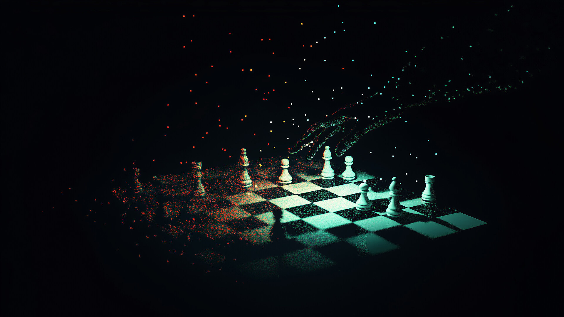
The screen now reveals the invisible hand behind it.

Design has always had a strange relationship with its artifacts. The artifact is what everyone can see, point at, argue over, approve, or reject. But the artifact was never the whole job. The job was deciding what the artifact should make clear, what it should refuse to do, which tradeoffs it should hide, and which ones it should force into the open.
I’ve always thought about designers as the translation layer, as the people who connect businesses with audiences through work that makes sense to both. Concept was product strategy before product strategy had a name. The tools change. The mediums change. But the work remains the same.
What’s happening now is where that translation has to live. MC Dean argues that if an agent is composing the interface, designers have to prepare materials an agent can play with: components, rules, priorities, and plain-language intentions. Fixing the generated screen becomes evidence that the setup is missing something. The better question is what the system failed to understand.
Quinn Keast gets at what changes when design moves out of the hand. Designers are used to thinking through gesture: physically and visually moving hierarchy, spacing, and attention around until the thing starts to feel right. The instruction loop asks for a different kind of attention. You have to translate innate design judgment into language before the tool can act on it. That may get easier with practice, but some of the cost is built into asking language to carry hand-knowledge.
Rasmus Andersson’s Figma story gives this argument a useful warning label. Figma looked fast from the outside because people inside were doing slow deliberate work underneath. One person might work on something for a year, and sometimes it went in the trash. Brad Wrage makes this concrete at Cash App, where a designer merged 25 pull requests across Android, iOS, and server. I read that as a last-mile ownership story. The old handoff hid too much of the last mile from the person responsible for the experience.
The same pressure shows up in less glamorous places. Jason Cyr puts clarity into the operating model: decision ownership, readiness, context flow, and the threshold for good enough. Fabrizia Ausiello uses Apple’s Liquid Glass slider to ask which decisions belong to the designer, because pushing judgment onto users can look like empowerment while simply handing them unfinished work. Alex Harper’s commodity-web argument adds an economic angle: when anyone can prompt a polished page, the pretty page loses economic value.
So the setup is now the design: the design system an agent can read, the brief it can obey, the refusal rules that keep it from being too clever, the review channel where a person still says no. That is less romantic than nudging rectangles around a canvas. It is also closer to what design has always been. When the next screen appears at 9:41 p.m., after an agent made a thousand tiny choices without us in the room, the invisible hand of the designer should still be there: guiding the work, constraining the nonsense, and making sure the product still feels like someone responsible and human touched it.
What I’m Consuming
Leonardo da Vinci’s Notebooks Are Whole Again, 400 Years After a Collector Cut Them Apart. Anastasia Scott tells the strange story of Leonardo’s notebooks being cut apart in the late 16th century, splitting drawings and notes that were meant to live together. The new Leonardotheka archive digitally reunites roughly 3,500 manuscript pages, including 50 confirmed reconstructions. A wonderful reminder that archives are not only about preservation; sometimes they repair old editorial violence. (Anastasia Scott / Discover)
SHRTCTS. This site turns keyboard shortcuts into a 3D illustration you can poke at instead of another cheat sheet you immediately forget. It’s like the Mac’s old Keycaps desk accessory on steroids. Pick an app, hover an action, and the exact keys light up on the keyboard. (DRANIKI)
The hidden pattern behind successful products. Lenny Rachitsky talks with Mark Pincus about the Proven, Better, New framework behind Zynga’s biggest hits. Pincus’s useful provocation is that founders often overvalue the new part and under-study what users already understand. His line that your instincts are usually right while your ideas are usually wrong is a brutal but useful product lesson. (Lenny Rachitsky / Lenny’s Podcast)
Web Browsers on Video Game Consoles. Declan Chidlow catalogs the odd, constrained history of console web browsers, from the CD-i and Sega Saturn to the PSP, Wii, and Xbox 360. I have a soft spot for this one because I worked on redesigning Sega.com for the Dreamcast browser in 2000, and these machines forced web designers to think about TVs, controllers, memory limits, and wildly nonstandard browsers. The web was never as uniform as our nostalgia pretends. (Declan Chidlow)
“Don’t You Just Upload It to ChatGPT?”. Juliette Giannesini turns a gym-locker conversation into a sharp little defense of professional translation. The funny part is the HR director suggesting ChatGPT for translation, then admitting she cannot use AI at work because it is not reliable enough. The serious part is the same one designers are dealing with: tools help, but judgment is still the job. (Juliette Giannesini / Correr Es Mi Destino)