

Editorial Is the New Job Description
Coherence is what users feel. Editorial leadership is the work that produces it.

A word kept showing up last week in several pieces I read, and it wasn’t “taste.” Luke Wroblewski’s notes from the Design Futures Assembly used it directly: about a hundred senior designers and leaders from AI labs, big tech, and startups gathered in San Francisco, and several of them reached for the same vocabulary. “Editorial” describes where design leadership is heading, Wroblewski wrote. What he heard was a shift away from making things and toward deciding what gets made and whether it all holds together.
I’ve been writing about the designer-as-orchestrator shift for a year, but “editorial” is a more precise word than “orchestrator” for what’s actually changing. Orchestrator suggests conducting players who already know their parts. Editorial means you’re standing over the whole portfolio asking which pieces belong in the magazine and which get killed. The Assembly’s other word, surfaced by a tool company founder, was “coherence,” the sense that a product came from one shared point of view. I like that one too. It describes the thing the user actually feels.
Nathan Beck draws the line between designing and styling and admits the part of the job AI is good at is exactly the part most “designers” were doing: pushing pixels in Figma. What survives is the upstream thinking and the downstream judgment. Taras Bakusevych walks through ten common UI patterns that won’t survive the AI shift—setup wizards, dashboards, CRUD tables, notification feeds—and audits each one against a single test: is this surface helping the human do the work, or helping the human check the work? Execution UI is shrinking; judgment UI is growing.
The editorial posture is what makes both halves work in production. Owen Williams, walking through an internal tool he built at Stripe called Protodash with Claire Vo on How I AI, gets to the same place from inside a real stack. Protodash produces high-fidelity prototypes that look like Stripe products because it’s wired to the Sail design system through MCP. Sitting in his own design reviews, Williams said the output got so convincing he couldn’t tell prototype from product. PMs are now the ones prototyping with it. Designers steer.
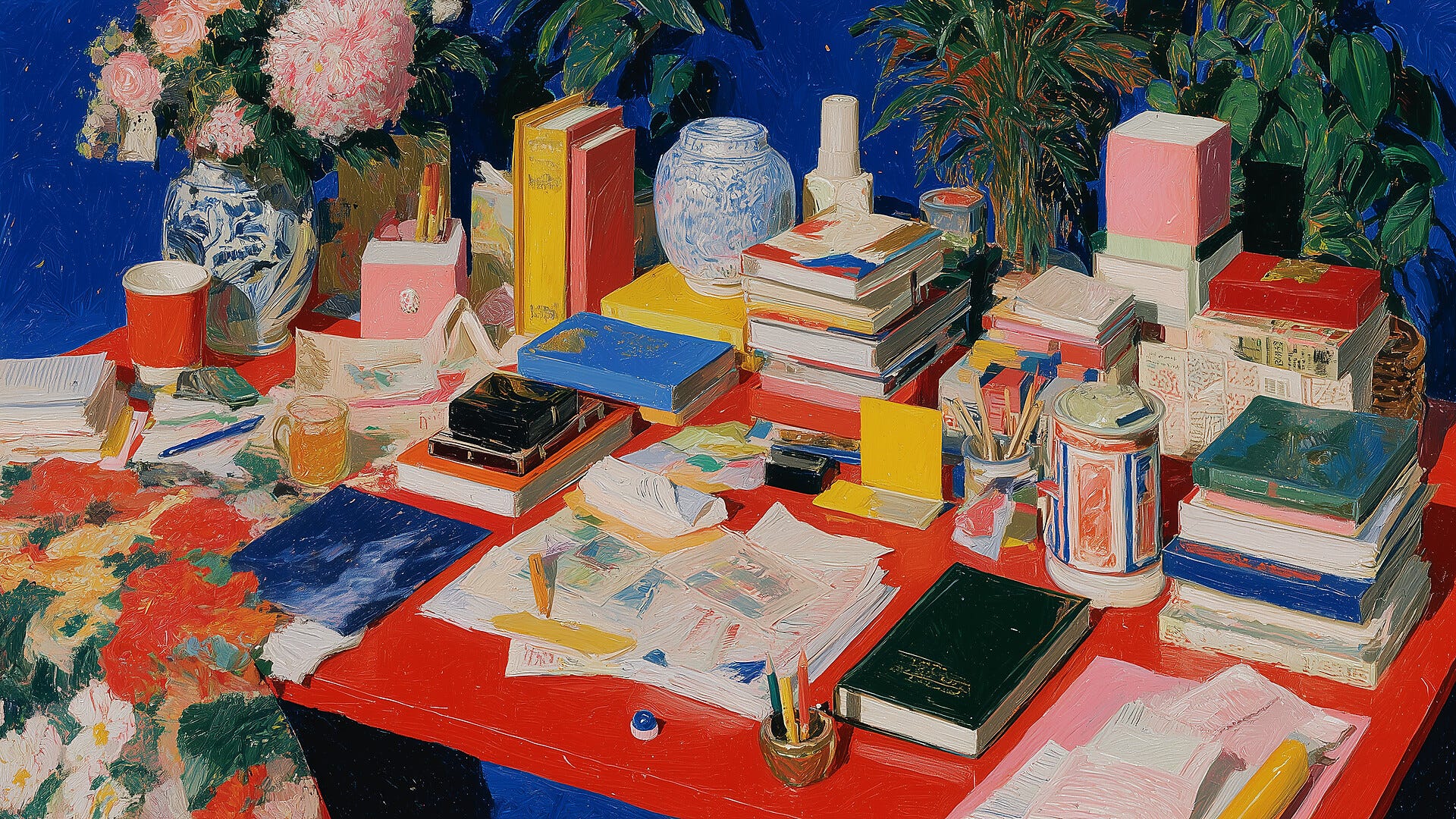
Jennifer Jerde has been running her San Francisco branding firm Elixir for 27 years, and Rachel Paese pushes her to put the practice plainly: she listens like crazy. The firm shows clients fifteen directions, not three, and uses the meeting itself as the instrument that tells the team which one is true. The difference between three and fifteen is the difference between presenting an answer you already have and presenting fifteen possibilities you don’t yet know how to choose between. Editorial work compressed into a single meeting: listen at scale, then commit.
The posture is structural, not personal. Ron Bronson ran a 40-person design division at 18F for four years, and his diagnosis of why most forward-deployed design programs never start is that orgs place designers downstream, after PM and engineering have already pre-resolved the questions design should be asking. Designers asked only to execute can’t be editorial. Bronson’s team was built to refuse the downstream brief by default, which is why the model worked there before it had a name.
What I’m taking away: the editorial layer needs both better vocabulary and the air cover to use it. A design leader’s job is to kill the promising things that don’t fit the product, and to defend the kill in the room where the engineer who built it is sitting. That work doesn’t appear in any Figma file.
Animated Pulp Noir: Review of Star Wars: Maul - Shadow Lord
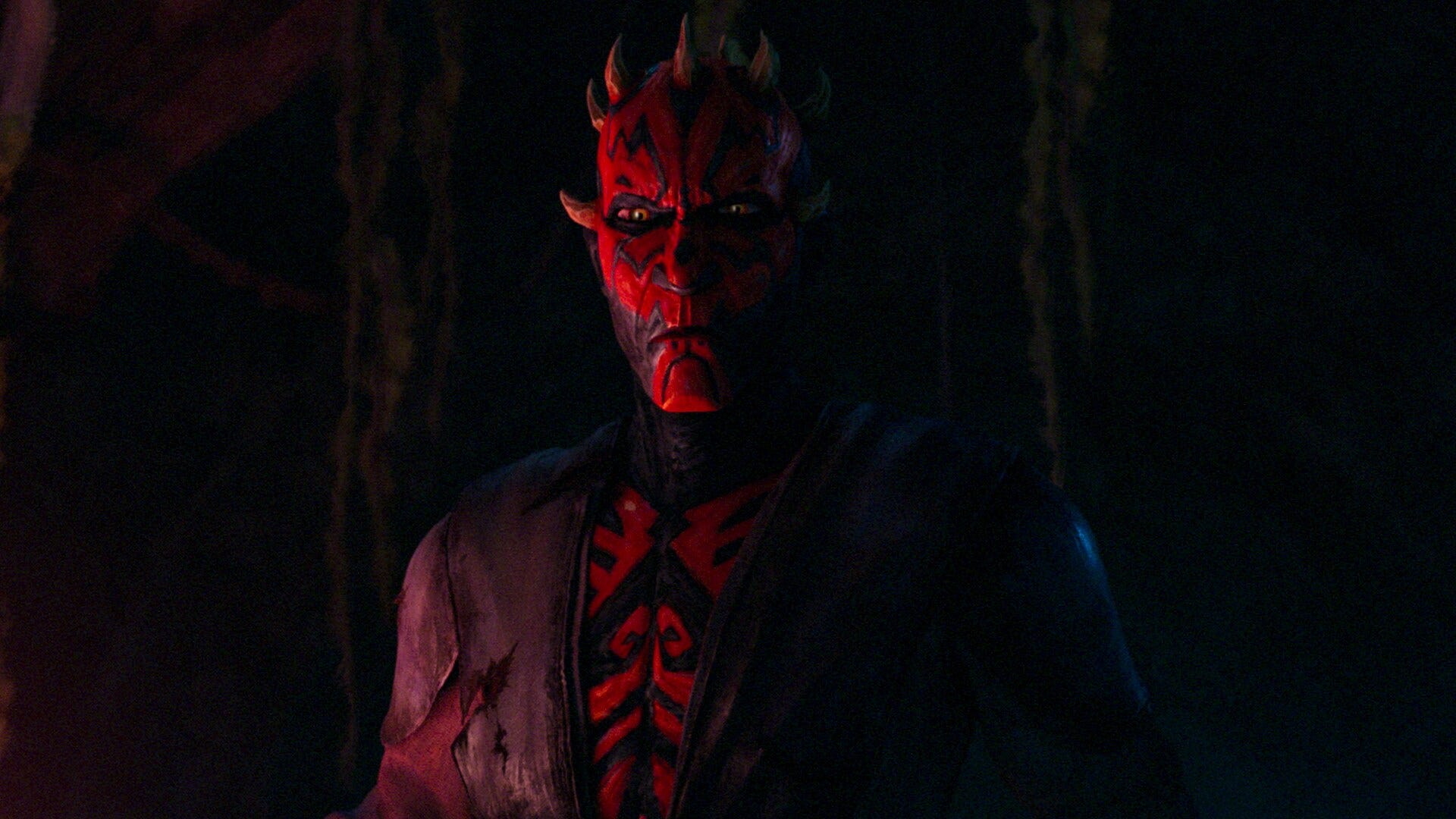
I’ve been a Star Wars fan since I was a boy. If anyone ever asks for my favorite movie, the answer is undoubtedly The Empire Strikes Back. The prequels were cool because the universe was dormant for 16 years and there was incredible pent-up demand to be in the world of Jedi, TIE fighters, and lightsabers again. If I’m being honest, The Phantom Menace wasn’t great. Little boy Anakin Skywalker is a character without much agency. Like Forrest Gump, he just stumbles into advantage. It’s luck.
The best thing about the first prequel was Darth Maul. He has only three lines of dialogue in the movie. Saying less builds the mystery around the character, much like Boba Fett in Empire. Maul is menacing and his movements are dazzling. He meets an unfortunate end though, getting sliced in half by Obi-Wan Kenobi towards the end of the film.
Despite looking very dead, Maul returns! In season 4 of Dave Filoni’s The Clone Wars animated series, it’s revealed that he survived, keeping himself alive through sheer hatred and the dark side, and becomes a major antagonist in season 5.
At the strong urging of my son, I binged Star Wars: Maul - Shadow Lord on Disney Plus. The story is great, but the visuals are stunning. Instead of standard CG fare, the filmmakers created expressive matte paintings in the style of old school visual effects. The textures on the characters and environment are Post-Impressionistic, evoking the paintings of Paul Cézanne and Vincent van Gogh. Characters feel like they were rendered with a brush, not a render farm.
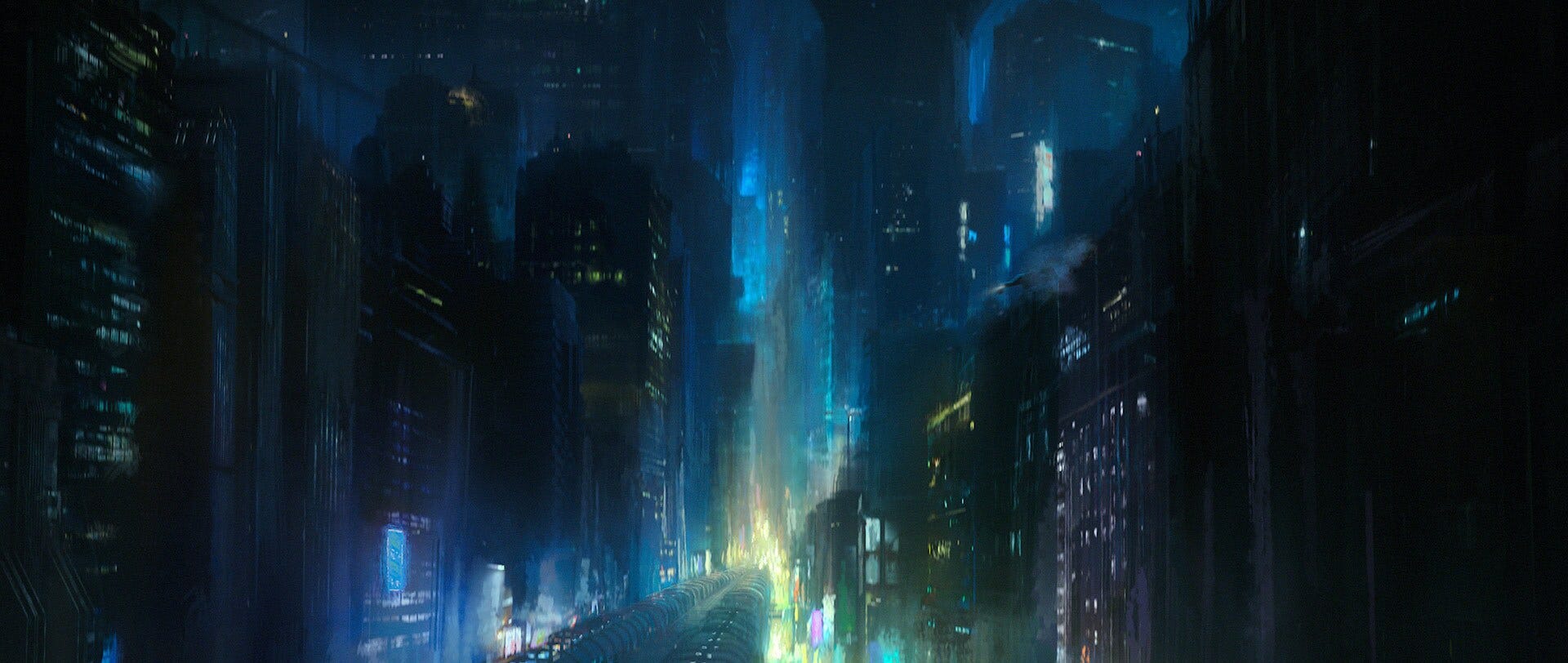
There’s a cyberpunk aesthetic that runs through the show and reminded me a lot of Blade Runner. In CinemaBlend SFX, series co-creator Matt Michnovetz cites Michael Mann’s 1995 Heat, as inspiration: “Heat is a good touchstone for Maul. There’s a pulpy noir feel to all this, where we’re going to show some of the underbelly of the galaxy and the crime syndicates. Maul is a great catalyst for all these characters coming together.”
If you’re a Star Wars fan, go watch it now. If you’re not, load up the first episode and just admire the visuals.
What I’m Consuming
From “System of Record” to “System of Intelligence.” Gio Ahern and his a16z colleagues make a structural claim about where enterprise software value goes next. CRMs like Salesforce and HubSpot won the last era because data accumulation was the gravity well. In the AI era, gravity moves to orchestration: the layer that pulls signals from the CRM, calendar, inbox, and Slack, then synthesizes before any action is taken. The CRM becomes infrastructure for the layer doing the actual thinking. (Gio Ahern / a16z)
How The Heck Does Shazam Work? Shri Khalpada built a hands-on essay walking through how Shazam identifies a song from a noisy 5-second clip in a coffee shop. The trick: convert sound to a spectrogram, throw away almost everything except the loudest peaks, and pair those peaks into hashes that act like fingerprints. You can hum into the page and watch the math operate live. (Shri Khalpada / Per Thirty Six)
State of Prototyping Spring 2026. UX Tools surveyed 1,478 designers and found that the most-used weekly tool after Figma is now Claude. Five of the ten most-used weekly tools are AI. The profession has split into thirds on vibe coding: 43.8% spend most of their time doing it, 37.7% do none, and the split tracks role most cleanly, with design engineers at 81% adoption and researchers reporting the highest anxiety. (UX Tools)
The Boring Internet. Terry Godier’s visual essay reminds you the internet isn’t dying; a commercial veneer is. Underneath the platform layer are SMTP (1982), IRC (1988), RSS (1999), NTP (1985), and Finger (1971), still running and federated decades after they were spec’d. Godier’s line: “no one can ruin email in a product meeting.” (Terry Godier)
Why It Will Take a Quantum of Content to Thrive on the Agentic Web. Garrick Schmitt walks through Generative Engine Optimization (GEO), the emerging discipline for getting brands shown well in LLM answers. AI-referred traffic grew 527% in the first half of 2025; Gartner projects traditional search will drop 25% this year. Schmitt’s prescription is recursive: structured, fresh, original, and human content, produced by an always-on loop rather than the old linear brief-to-launch cycle. (Garrick Schmitt)