



In the summer of 2025, a new browser war was brewing. Perplexity launched Comet, and OpenAI followed that fall with ChatGPT Atlas. Both competed with Dia, but I was particularly impressed with Comet and Atlas because they could browse the web for me. I handed them a grocery list and asked them to fill up my Whole Foods shopping cart. Even though the process was slower than if I’d shopped manually, it was an aha moment. I wanted to be able to control my computer, the websites I visited, and the apps I used with plain language.
During my research for this essay, I went to Amazon to see if they’d integrated something like this natively on their site. And they did! Alexa for Shopping helps you shop on Amazon via conversation. I tried my grocery list experiment again. Within 15 seconds, my cart was filled with the dozen items on my list. Last year, Atlas took over 11 minutes and Comet took four.
There were two mistakes, both worthy of no more than a shrug. I’d asked for mild Italian sausage and Alexa found a package of frozen, which I wouldn’t have gotten. But to be fair, its options were slim. It also added two bunches of carrots instead of two loose carrots. Easy to correct in the cart.
The more I use apps in 2026, the more I want to start by telling them what I need. By chat, I mean expressing intent in plain language, typed or spoken. Give it the grocery list. Describe a design to make. Then use the controls when there’s something to inspect or change…
What I’m Consuming
3% Different with Adam Ho, I.S.P. Katie Chiou interviews graphic designer Adam Ho about bringing a recognizable point of view to tech brands. He describes generating image variations, layering a selected image into his Photoshop work, and brushing over it again. That specificity makes the interview interesting, especially the typeface choices behind Fal’s identity. (Katie Chiou / LINER NOTES)
Interface Cheat Sheet. Jakub Krehel collects the visual-design details that help an interface feel polished, with interactive comparisons so you can see the difference. Turn on the guides to compare nested corner radii or the placement of a play icon inside a circular button. (Jakub Krehel / Interfaces)
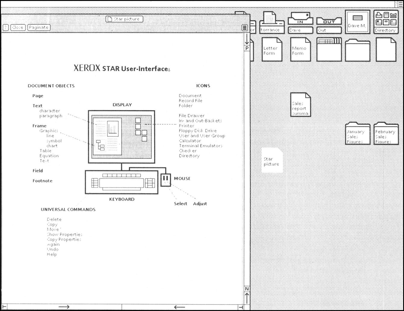
Designing the Star User Interface (1982). Xerox was studying how people work and designing software around them back in 1982. Reading this in 2026, I’m amazed by how familiar and relevant the advice still feels. The Star team studied people’s work and designed the interface to help them see what they could do next. (David Canfield Smith, Charles Irby, Ralph Kimball, Bill Verplank, and Eric Harslem / Xerox Corporation)
A Brief History of the Bloomberg Terminal. Allison Marsh follows the terminal from a machine for bond prices and calculations to the financial workspace it became. The keyboard gets its own history, including the color-coded function keys and the trackball added in 1990. (Allison Marsh / IEEE Spectrum)
Dimensional Drawings of Apple Products. Apple publishes the measurements accessory designers need to work around its devices. The iPhone 17 Pro drawing includes enlarged corner profiles and separate views of the camera assembly, with dimensions packed around each one. I could spend a while looking at those curves. (Apple Developer)
Note: Summaries of links here were written by AI and edited and approved by me.